This post is 15 months overdue! Last winter, my dad came to stay with us for 3 months and renovated our kitchen. 15 months later, we still are in love with the results, and I’m finally here to tell you allll about it! Get your beverage of choice, you’re gonna be here awhile. This is long. Like, long long. Long long long.
I’ve talked about our kitchen a bit before. Here’s the “before” before, when we moved into our house. I did a post about painting it. And I gave you a tour after painting. I thought about breaking this up into multiple posts too but nope, you’re just going to have to have it all. I’m too excited to organize my thoughts so it’s all or nothing.
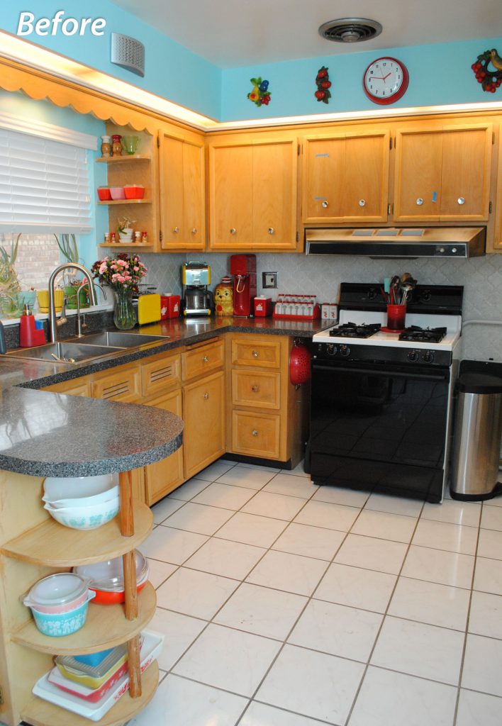
We have a small 1950s kitchen with eat-in area. The main things we wanted to solve were the weird setup of our stove sitting in space, shoulder-bumping cabinet in the doorway (spoiler: I’m THRILLED at what we did to solve this issue), lack of dishwasher, and fluorescent lighting in soffits. Plus painting cabinets (spoiler: reasons), appliance upgrades, and getting rid of ugly backsplash tile and flooring. Nothing earth-shattering… I mean we lived with it all just fine for 8 years. But we wanted to make improvements to make it a more usable and more “us” space. And boy, did it ever work.
How about some overall photos first, and then I’ll talk you through.
Here’s looking into the kitchen from the dining area. This is a before photo. I didn’t get a very good comparable one before the remodel, so this is from 2015:
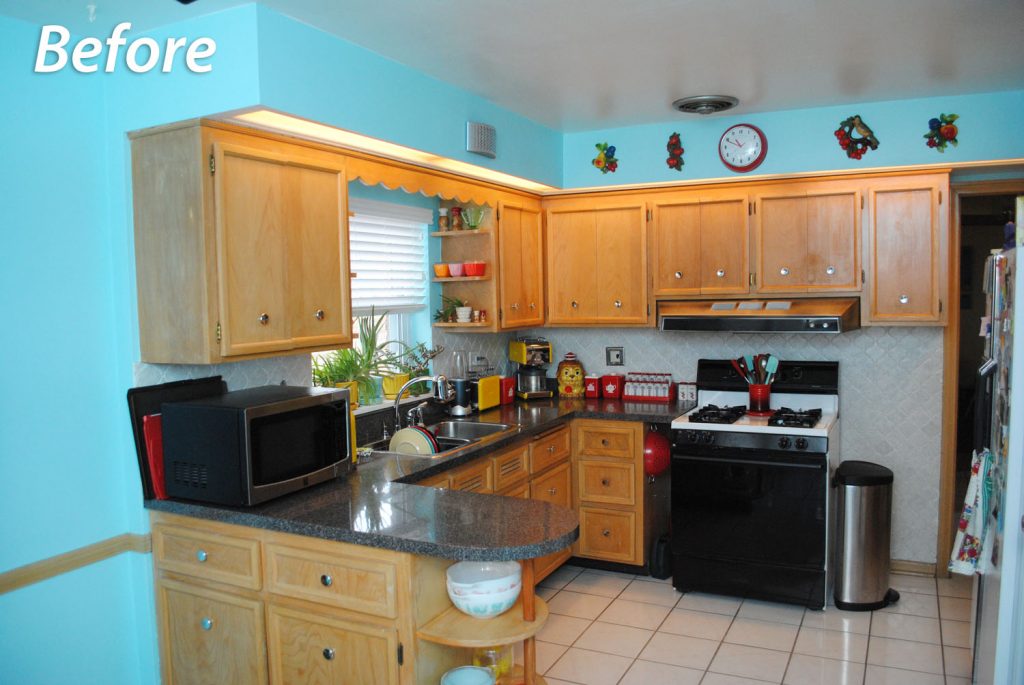
The photo below is from just before the remodel though. But after I’d already started putting painters tape up in random spots to measure things, ha ha.
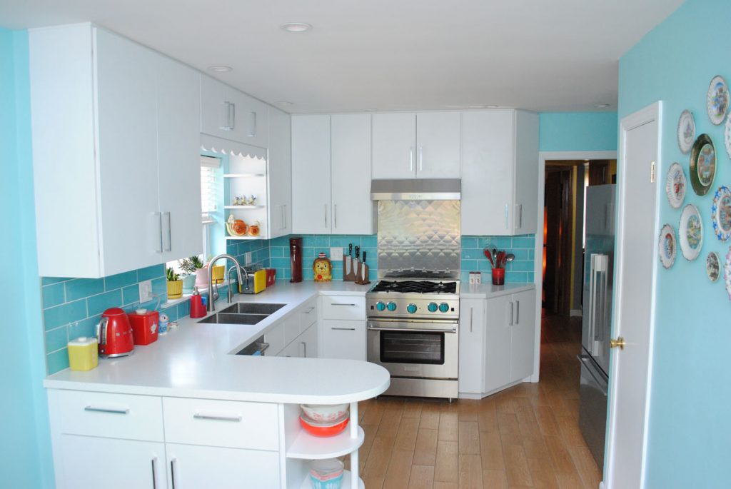
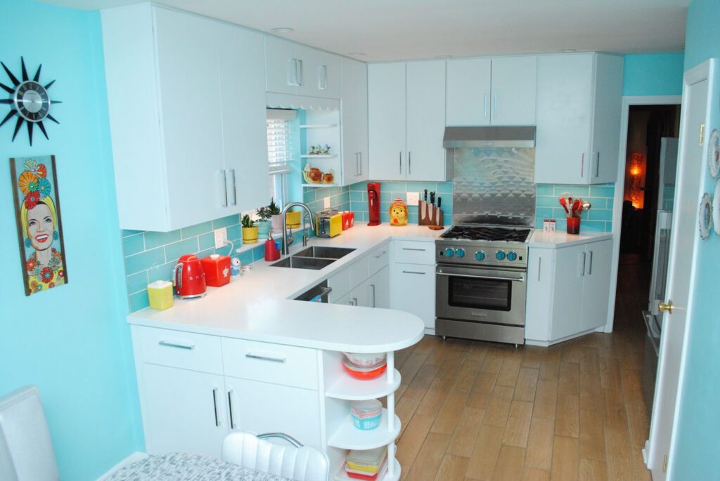
Here’s after! (Side note—I took a lot of photos with variety lights on and off. Nothing was ever perfect so it’ll jump back and forth a lot.)
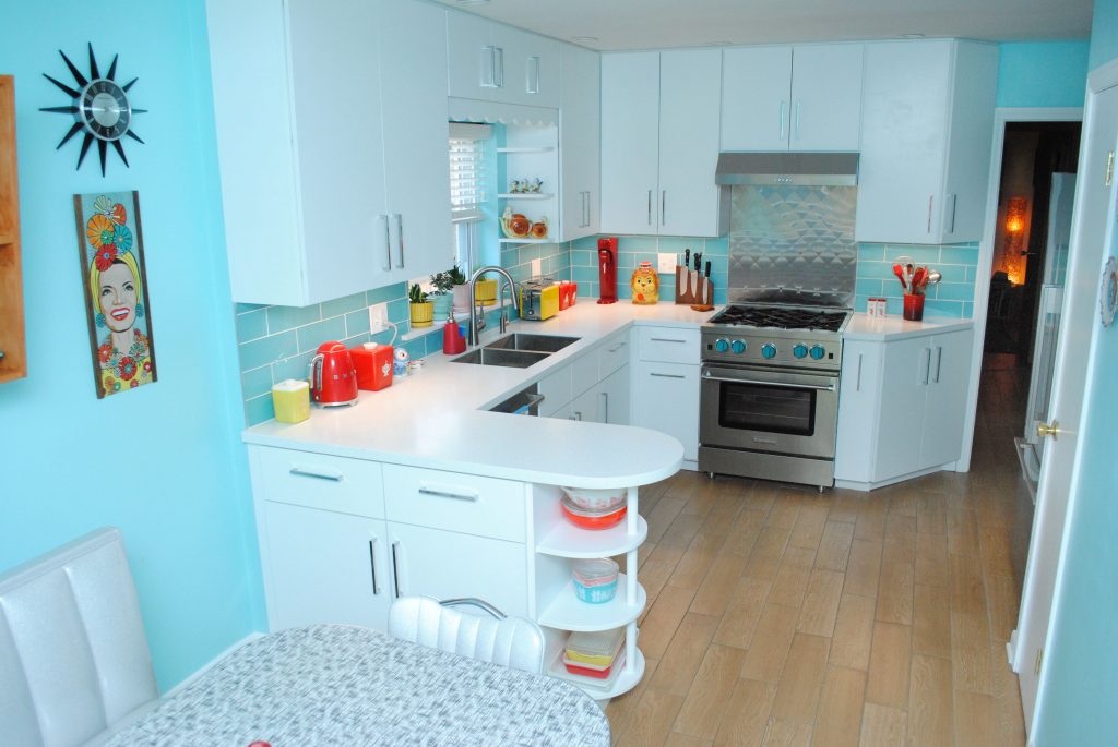
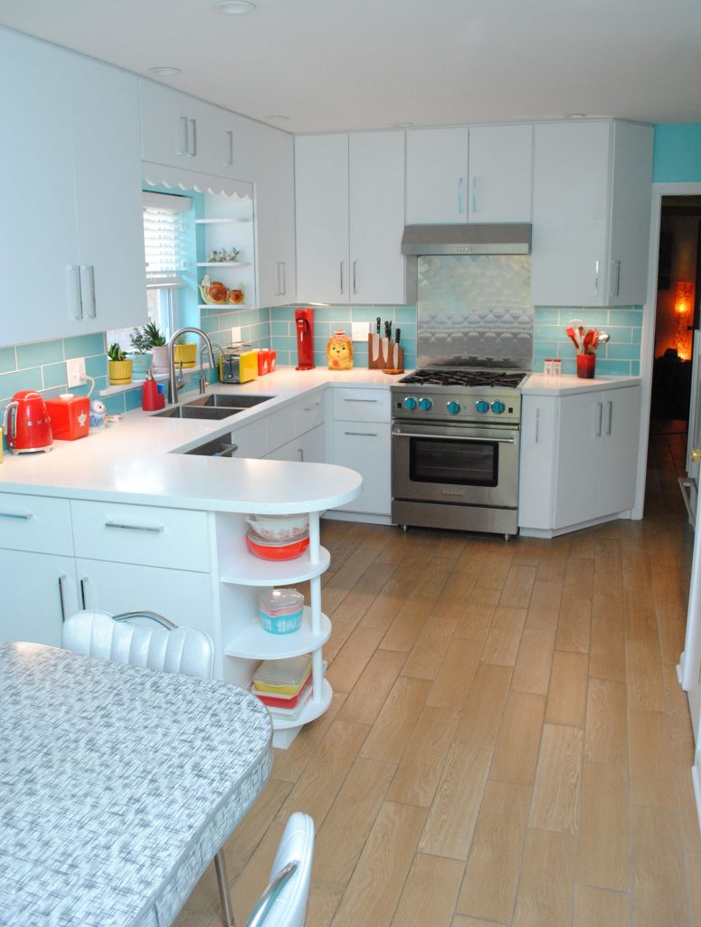
From standing in the kitchen, before (with our cat Dinah in it, who died earlier this year ?). This is another from 2015:
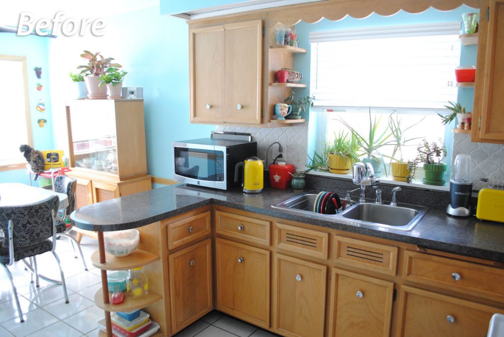
And now!
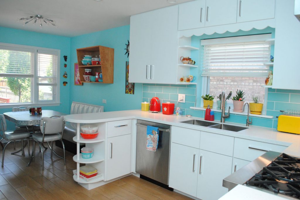
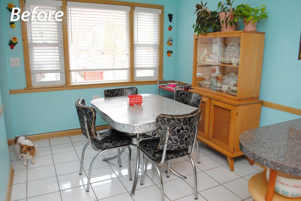
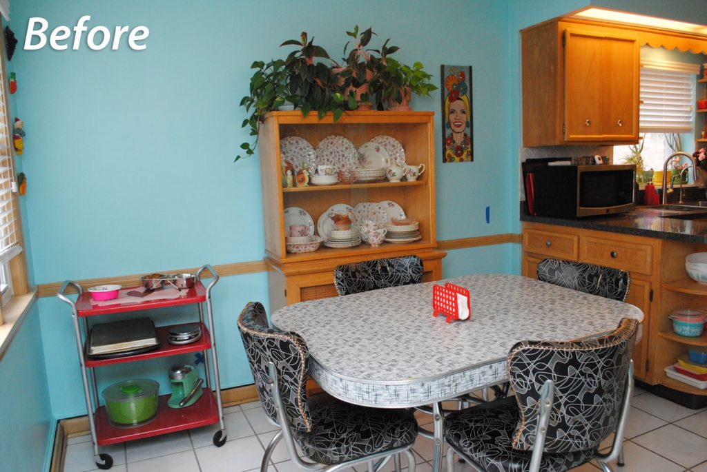
What the eat-in dining area looked like before:
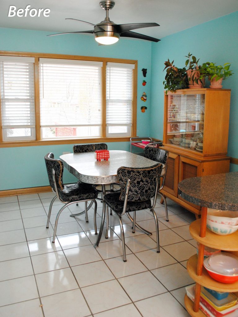
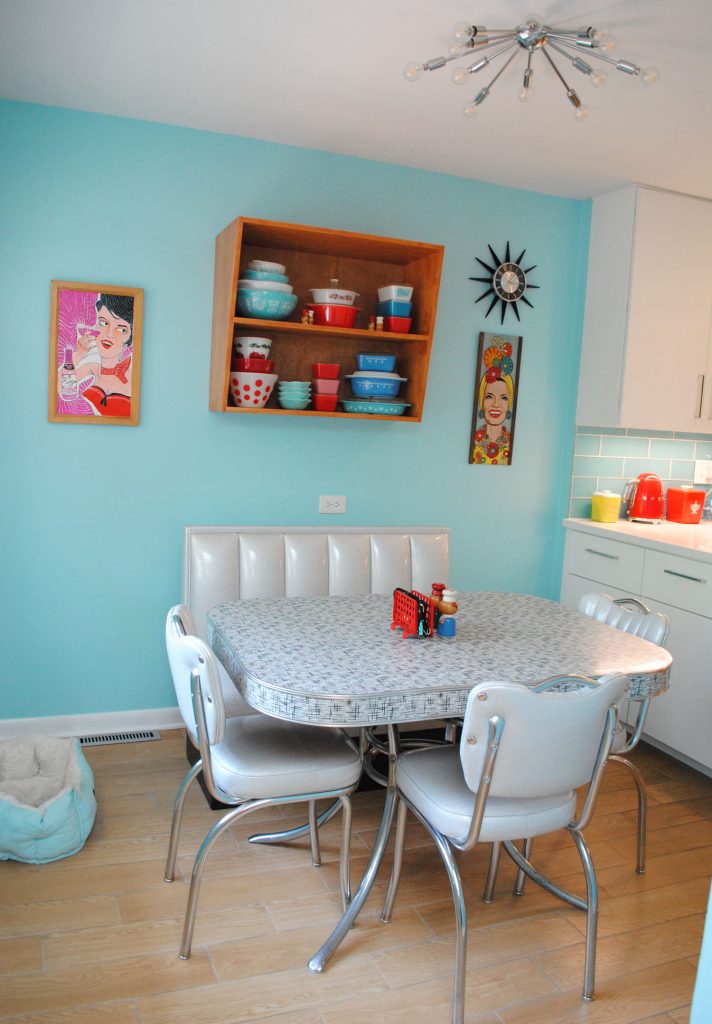
And now!
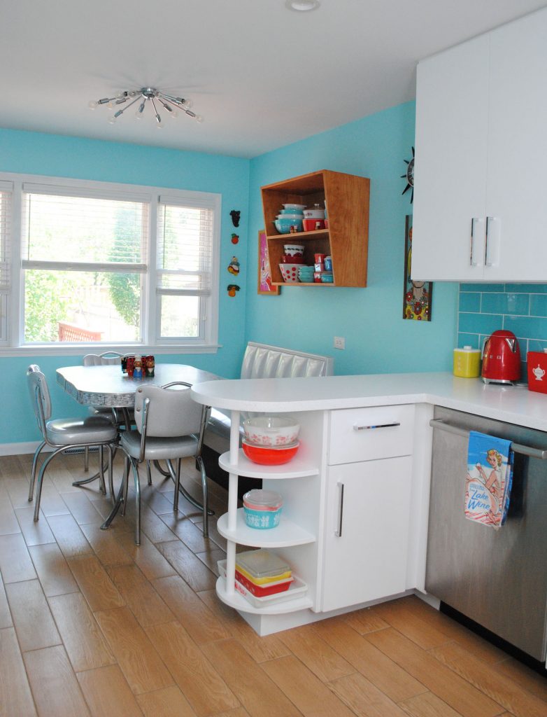
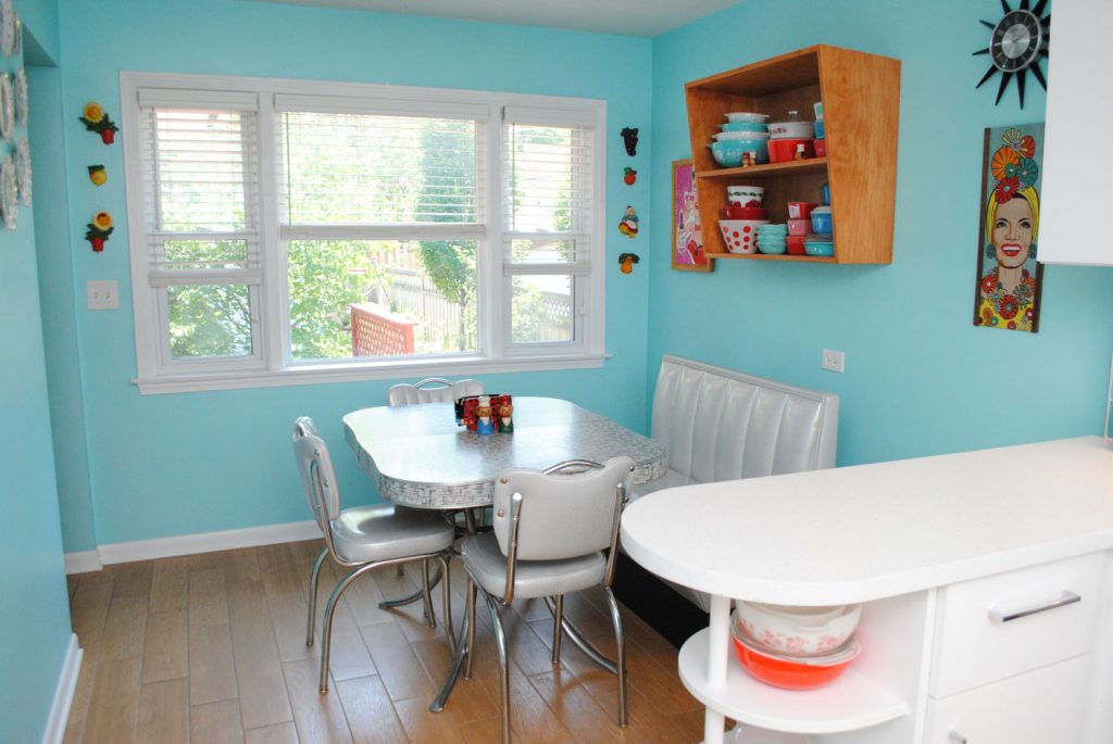
Okay, so those are all the big areas covered. And by big, obviously I mean small, since this is far from a big space! But so much was transformed.
Now, where shall we dive in? How about cabinets!
One of the biggest changes that we wanted to make was to get rid of the soffit and florescent tube lights, and then extend the cabinets to the ceiling. I don’t mind soffits in mid-century kitchens when they’re flush to the cabinets, but ours overhung everything and the lighting was awful. We were lacking in storage space too, so the solution was to take the cabinets to the ceiling.
Because we were also doing a somewhat-major reconfiguration on the stove wall, it ultimately meant that my dad built new boxes for all the uppers. And because I love the look, full overlay doors. We already kind of wanted to paint the cabinets white to brighten up the kitchen, but this plan meant it was a must to paint, anyway. We know our cabinets were white in the 50s and the previous owner stripped them. Now we’ve returned to that. And wow, it’s made a huge difference in brightness, combined with several recessed can lights in the ceiling.
I fretted so long about the white paint color, because I didn’t want it to read too yellow, or blue, or gray. We painted samples on cardboard and tested them out once we had the recessed lights in, which are warm-toned. We went with Benjamin Moore Chantilly Lace and couldn’t be happier!
Here’s a look at which cabinets are original. The ones not circled are the new boxes custom built by my dad:
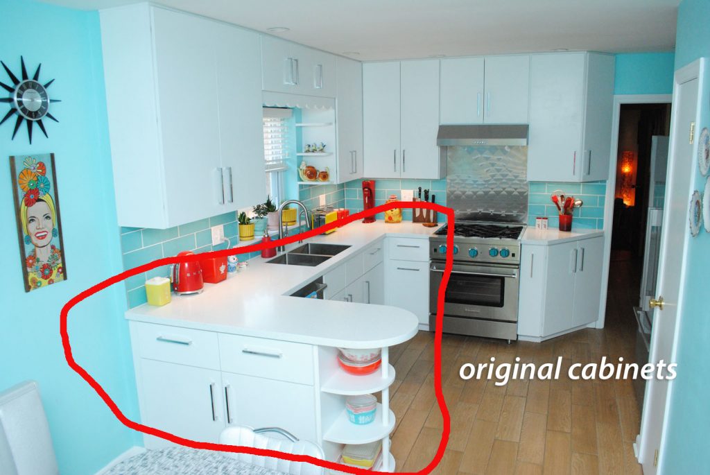
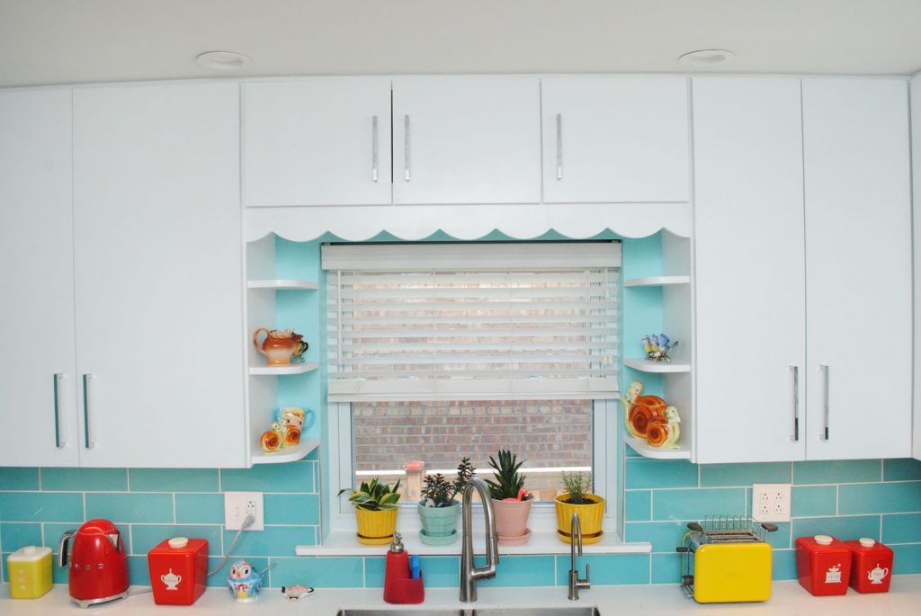
But there’s one more original piece! I think of it as the keystone in the kitchen. We knew we always wanted to keep the scalloped valance above the sink. After all, that and the sink display shelves were one of the things that first attracted us to this house.
The display shelves had to be rebuilt new (they were very water damaged), but my dad put back in the original valance. He shaped the shelves from the old ones.
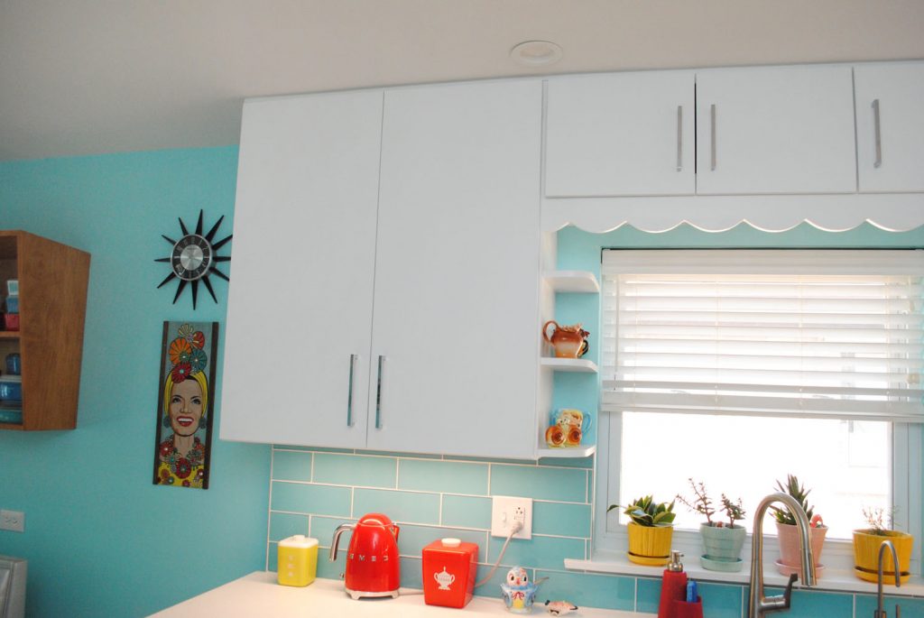
I love this area even more with the new cabinets above the valance! When we discussed taking the cabinets to the ceiling, I knew I still wanted the sink area to look the same, so we added two short cabinets up above, keeping the valance in approximately the same position as before. Two doors open out together for wider access on the left, and then a third door on the right. They’re small but mighty—plenty fits up there. I love this design addition!
And while you can’t see it, there’s a light under those small cabinets above the sink, too.
Here’s the before look:
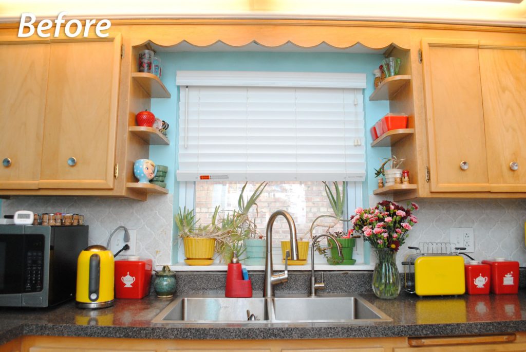
Largely the same, yet so much better now. I love this whole wall in general even if I can’t back up enough to get the whole thing without being inside the fridge!
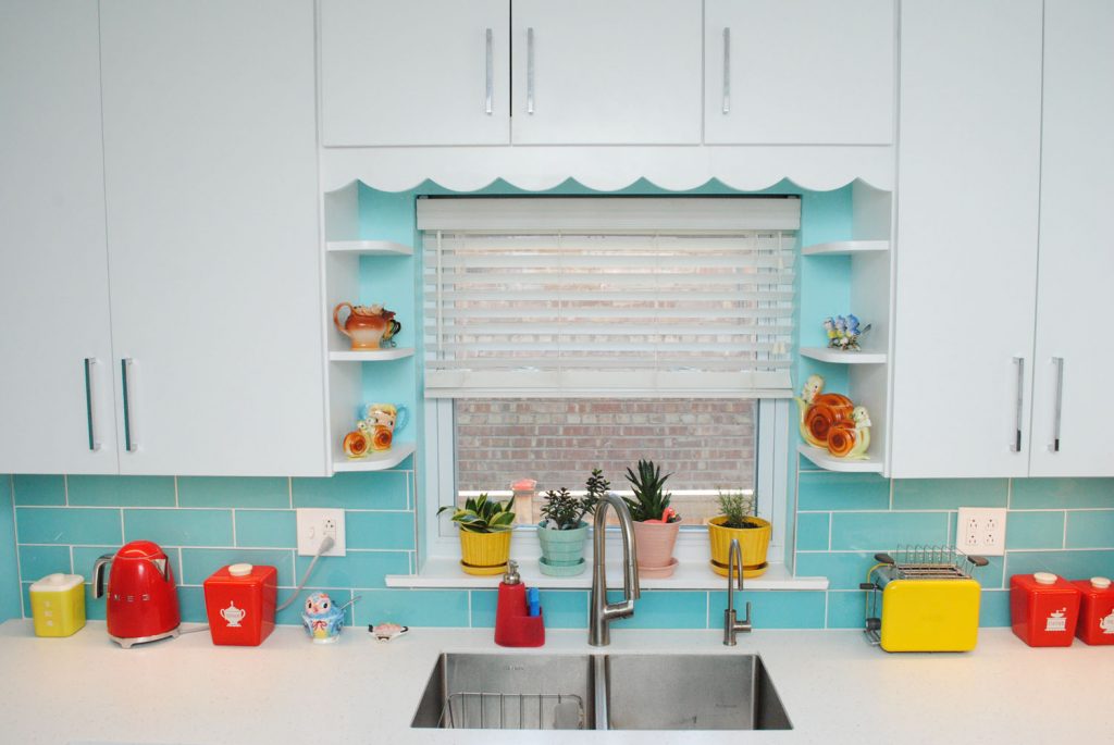
Same faucets and Elkay sink as we had before. Smaller faucet is our reverse osmosis filtered tap. We got the sink and faucets a few years ago and really liked the sink, so no need to change. I know double vs. single bowl is a hotly divided issue but double works for us. (The normal faucet is getting a bit dicey so we might switch that out at some point soon.)
Fun fact, when we bought the sink we got one that could be over or under mounted, with the eventual knowledge that we’d under mount it in a remodel. And now we have!
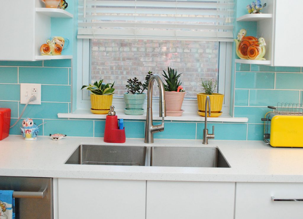
With those small new cabinets above the sink, I thought it would look nice to use the same nearly 8″ bar pulls we used on the rest of the cabinets (which I LOVE, these ones from Wayfair) but slightly shorter since they’re much smaller cabinets.
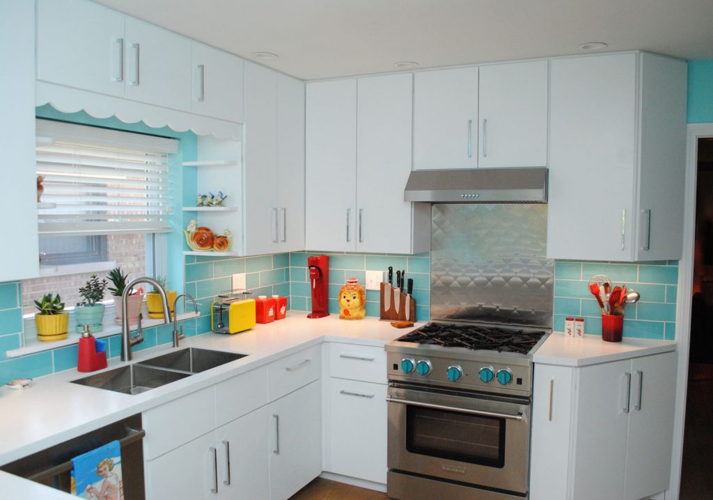
I guess you can’t really see a difference in photos, but it worked out really well. I’m so glad we went with the long, simple cabinet pulls. I love the look!
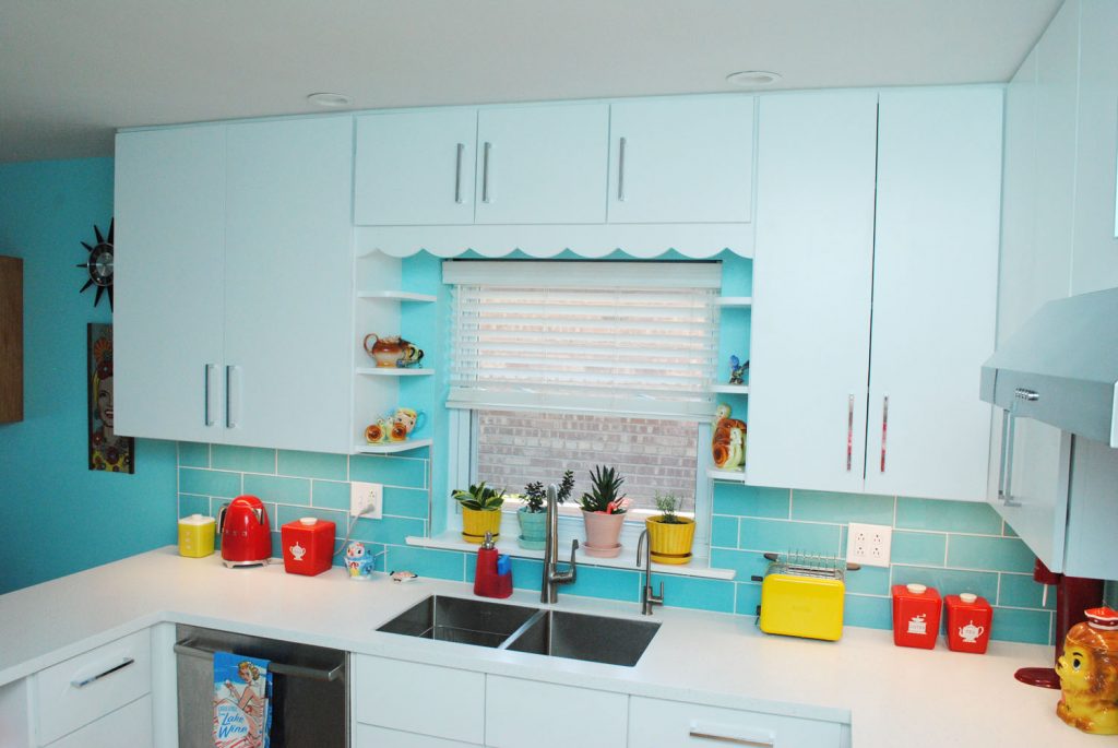
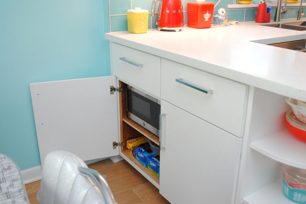
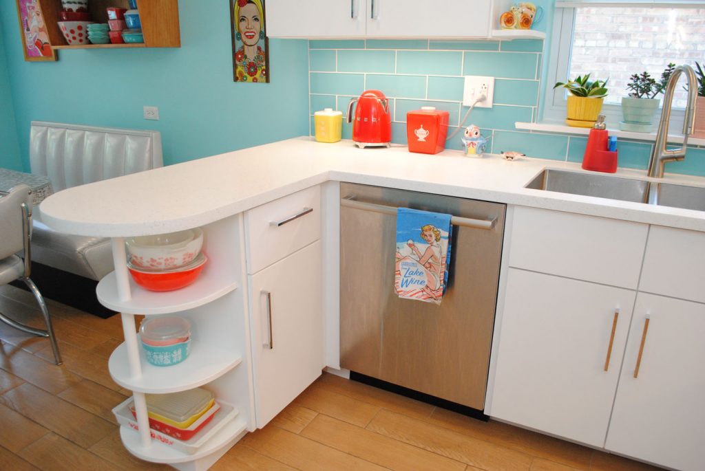
Back down to the counter. Another difference you’ll see on the counter on the left side… where’s the microwave? No, we didn’t remove it to stage these photos. We put it on its own breaker (oh yeah, preceding the remodel we finally upgraded our original electrical panel), and put it in a lower cabinet!
I know this wouldn’t work for everyone, but it works great for us. And since it’s next to the bench in the dining area, you can sit on the bench and wait for it if you want. And with it being in the peninsula, you can pass things from it into the main kitchen area easily, too.
In its place is the tea department. Which was there before in a slightly different configuration, but more crowded.
No I didn’t do what so many bloggers do in kitchen reveal photos and Photoshop out the cord or switch plate. It’s a cord and switch plate, deal with it.
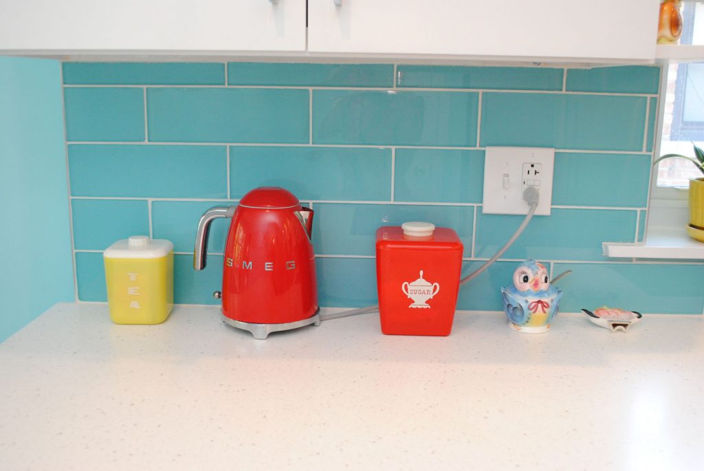
Moving the microwave off the counter and into a cabinet freed up so much counter space! OMG. And especially useful with the microwave in the cabinet below.
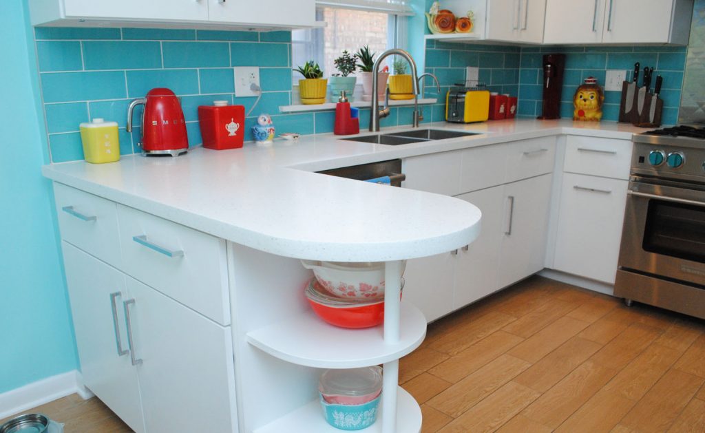
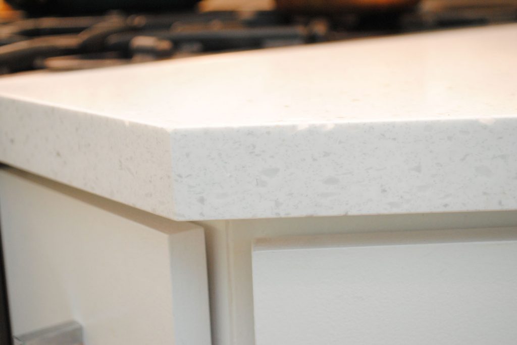
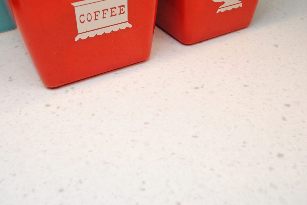
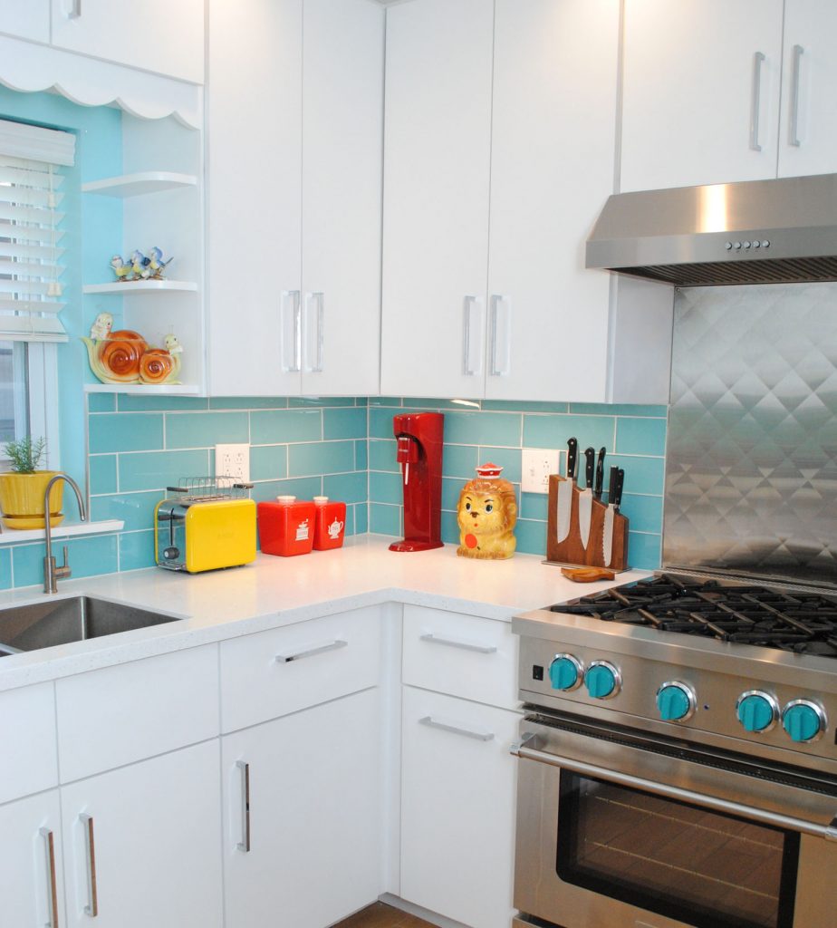
There’s a few other obvious counter differences, too. Namely, the actual countertop. I no longer have ugly faux granite laminate!! We had it in our condo and then this house had it too. I loathed it. Now, we have solid surface and love it. It’s LG Hi-Macs in Ice Queen. I started a bit of a trend on Instagram and at least two friends have since put it in their kitchens. 😉
It’s almost impossible to photograph, but it’s white with gray inclusions that remind me of terrazzo. Those lighter bits at the edge aren’t chips, they’re just lighter inclusions that catch the light. Plus there are flecks of glitter in it! Glitter! Swoon. You’ll just have to trust me on that, I couldn’t capture it.
While we’re in this area, let’s talk about the dishwasher. We knew we wanted to install one, but it meant losing a cabinet and a drawer, and moving the peninsula about 7″ into the dining area, making a small eat-in area even smaller. But both were sacrifices well worth making. Holy crap, do I love having a dishwasher.
It did also mean that the cabinets above and to the left of the sink became 7″ larger than before. Those are massive cabinets!
So much space! The top is used for the least-needed stuff, because it’s kind of hard to get to given the peninsula. So it houses my Christmas Pyrex.
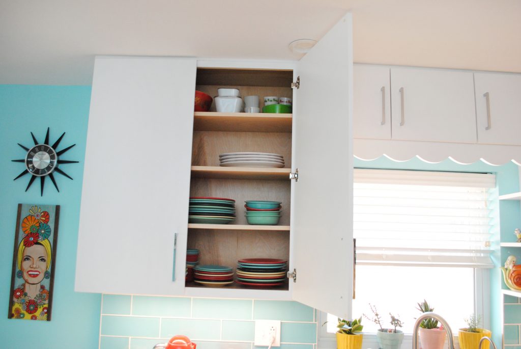
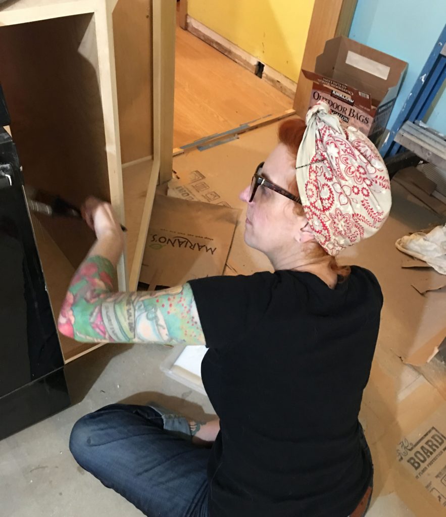
Fun fact: I mostly did planning and design in this kitchen, but one physical thing I did was polyurethane inside all the cabinets! Both the new ones and the freshly sanded shelves and boxes in the old ones.
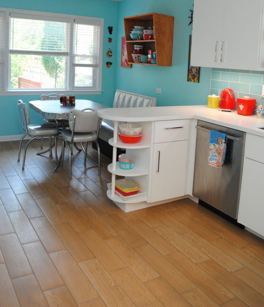
Let’s pop down to the floor briefly, shall we? We used to have large white ceramic tiles that had weird peach and blue veins running through. We wanted to stick with tile to be pet-friendly (we now have two old lady dogs! 🙂 ) and went with a wood-look porcelain, with radiant heating underneath (we have that in our bathroom too). I know there’s probably someone out there clutching their pearls that we’d lay wood-look tile against entryways into rooms with wood. I’ve said it before and I’ll say it again: deal with it.
We were originally going to go with a terrazzo-inspired tile but realized we really wanted to add back a bit of warmth, with all the white and cool aqua shades. And any warm terrazzo tiles were just not up our alley. We’re very happy with our choice.
We also changed the vents in the kitchen from some strange wall ones along the baseboards to two vents in the floor, which has made air circulation a lot better in the kitchen.
The old tile ran into our den (off the kitchen) and the hall, and then appeared again in the foyer in the front, so the kitchen and hall got the new tile. The den and foyer? Well my dad texted me a photo (when we were in Washington, D.C. while he ripped up the old tile), when he discovered there was wood under it! This is from the front foyer:
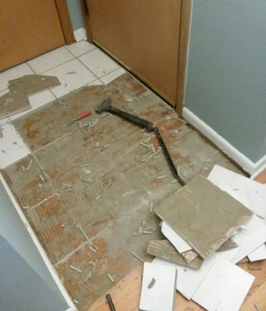
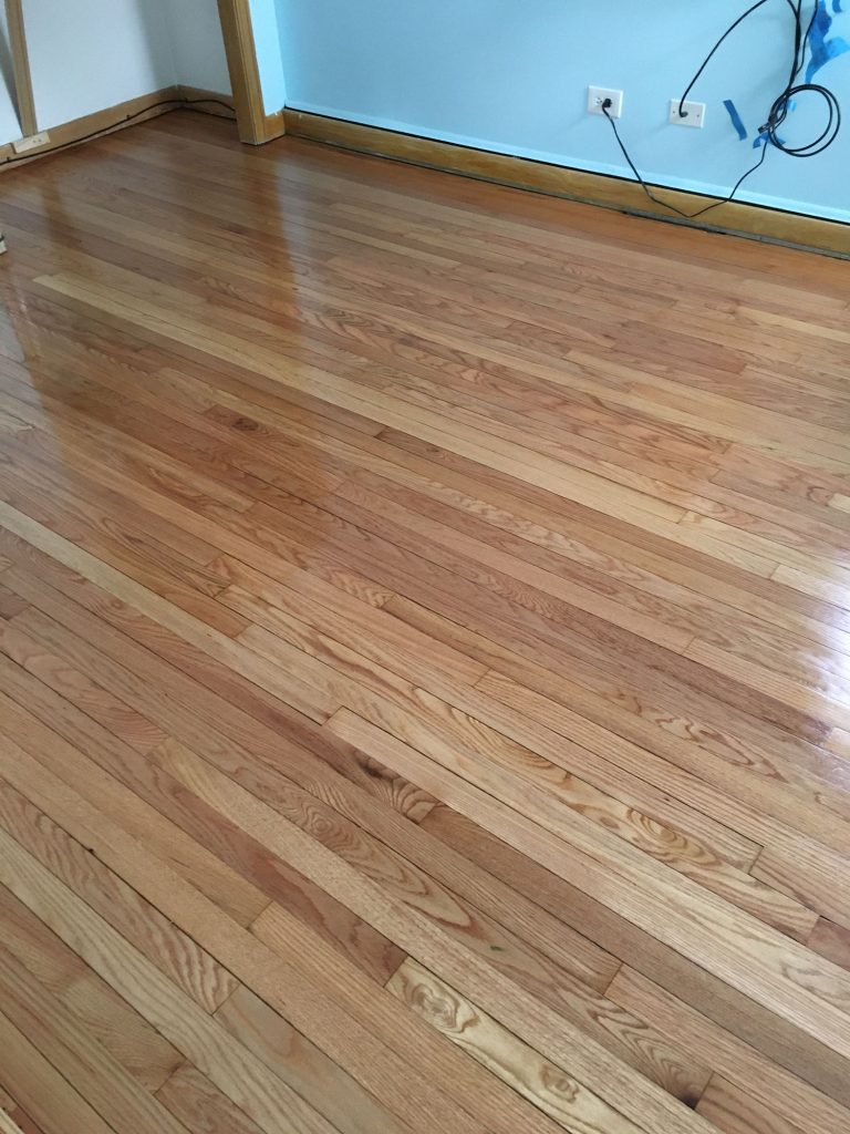
Turns out the previous owners laid ceramic tile right on the oak hardwood floors! Why?! So we hired someone to refinish them and turns out they were in great condition. What a bonus!
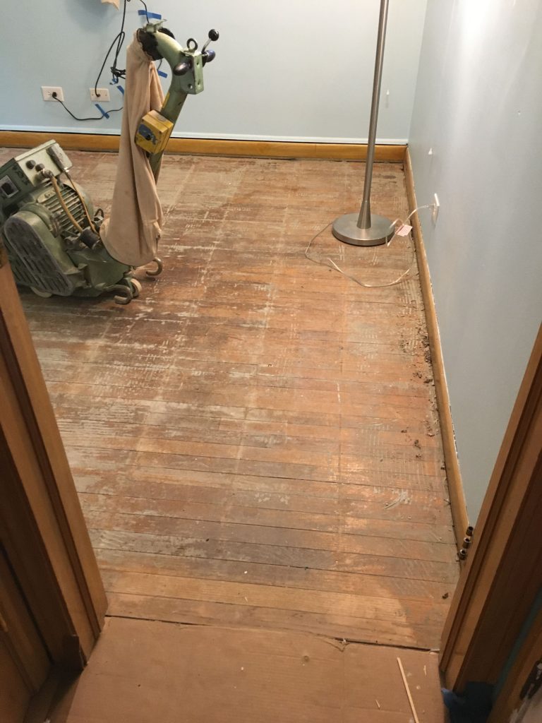
We always wondered why the den had tile instead of wood like the other bedrooms. Well, now it does again.
So moving up again, and let’s take a look at the stove wall. That’s seen the biggest change! And the area that I’m most proud of, because I came up with the idea that really transformed our space the most. It was truly a pivotal change.
Here’s what it looked like before:
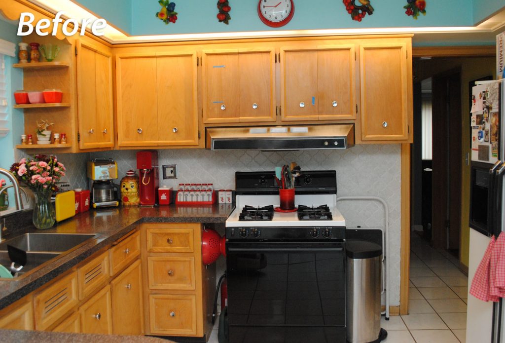
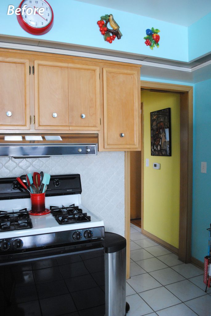
A 40″ range hood over a normal 30″ stove that was centered out in the middle of space. A countertop extended to meet the stove on the left side. No cabinet on the right side on the bottom. And an upper cabinet right in the entryway, that was easy to bang your head or shoulder on, and just made it feel a bit awkward walking in and out of the room. Or using the trash can below it (which really had nowhere else to go).
So these were the trouble spots to solve:
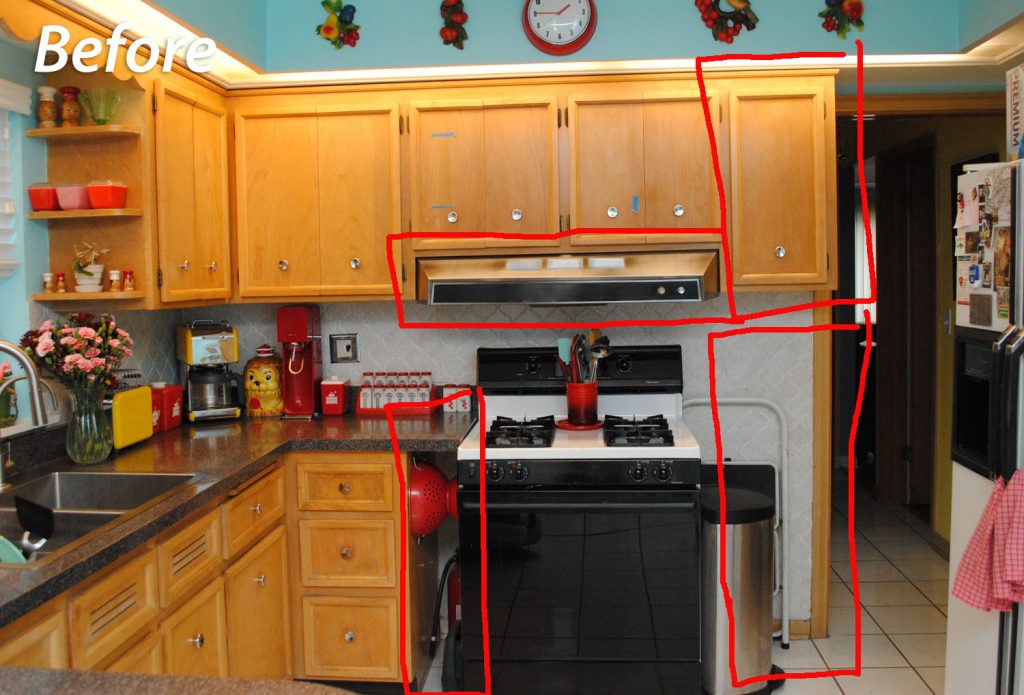
That’s a lot! And it was literally years before I hit on the solution. I think I had my revelatory idea about a timely 8 months before this remodel started. And it of course involved plotting and planning with my dad. We had some fun with cardboard templates and drawing on the floor. In the end he made my vision happen perfectly! TA DA:
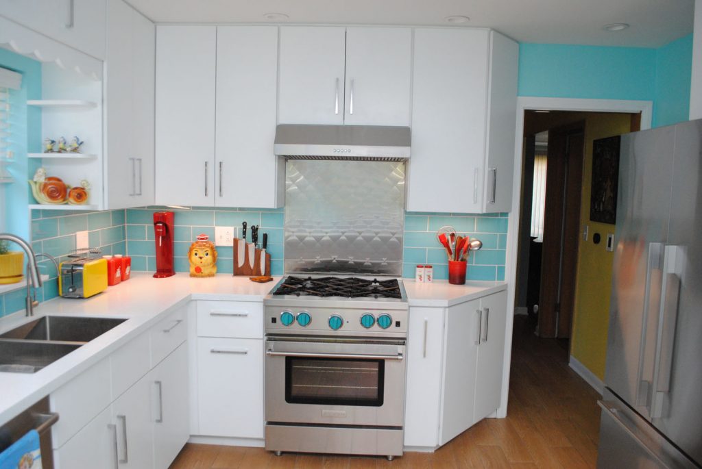
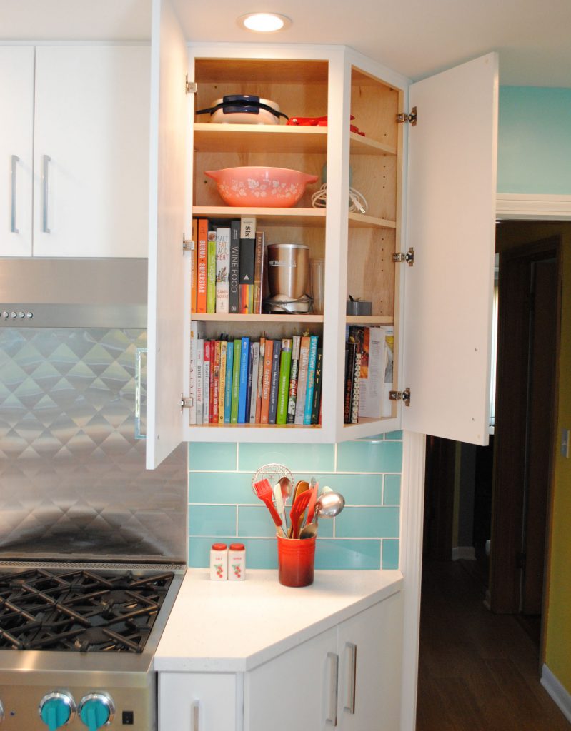
Because we were doing all new uppers, it was a lot easier than trying to re-configure what we had. We moved the (new—we’ll get to that) stove over to meet where the lower cabinets stopped. And then did angled cabinets to the right of the stove, both for the uppers and lowers.
In the lower, we did a skinny spices drawer pull-out which we love! Before, we just had them all in a drawer and it was awful.
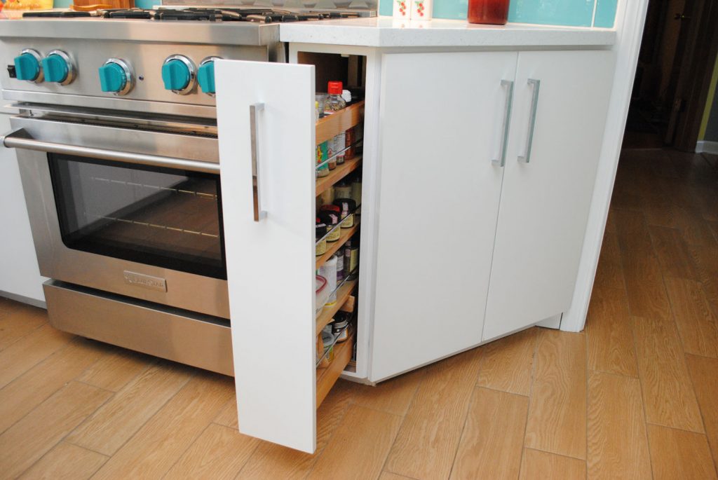
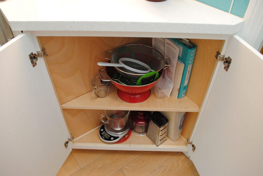
In the angled part of the lower, we have two doors that open into a triangular cabinet with two shelves. It’s a great spot to fit items we access a lot, like colanders, recipe notebooks, and measuring cups.
In the upper, both doors open out to shelves that home our most-used cookbooks and various other sundries. And all that new counter space!!
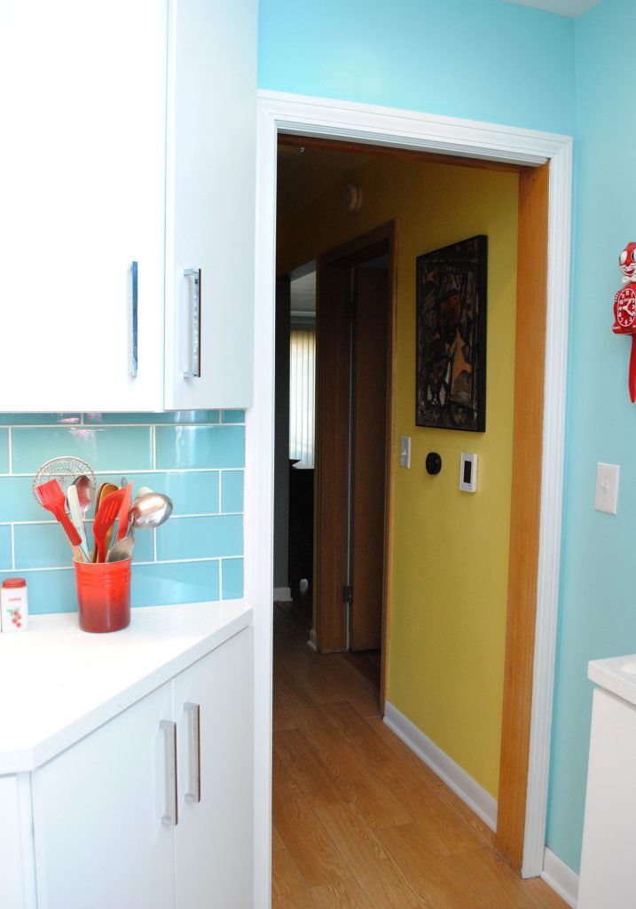
Let me tell you, the difference in the doorway into the room now is huge! I didn’t realize I was kind of ducking to the side when I passed through the doorway until the old cabinet was gone and I found myself still doing it for a few days!
Before vs. after:
On the left side of the stove on the bottom, there used to be 3 drawers. The bottom was really too deep to be useful and the middle was used for our spices. The top drawer was fine, and housed cutlery (and still does).
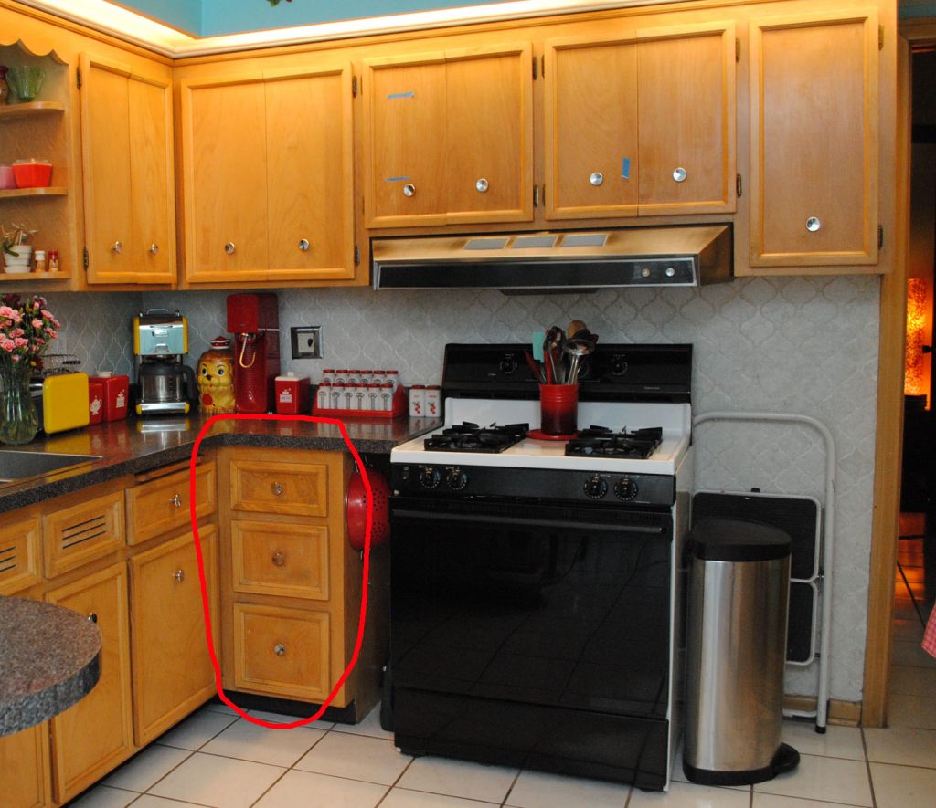
Both lower drawers held items that had new homes in the new layout. So we transformed the space a bit to house something that didn’t have a new home–our cutting boards and baking sheets, which used to live behind the microwave on the counter (which we didn’t like, but there was nowhere else for them really).
Now we have a pull-out drawer for those, and it’s fabulous! I had my dad make it with three slots, so we can keep things organized.
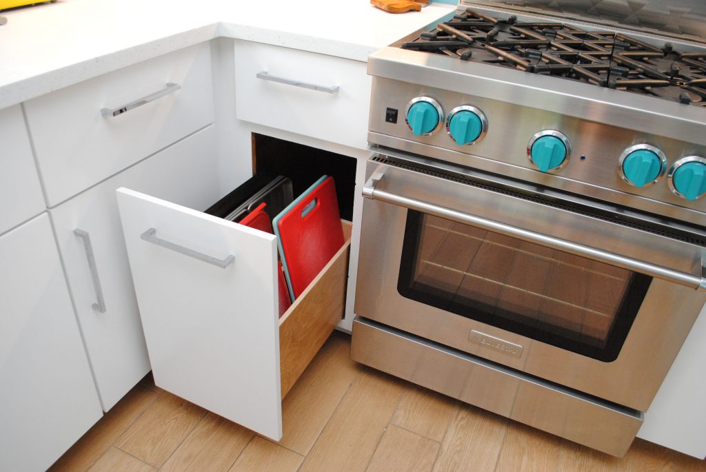
I’m not gonna lie, I have frequently in the last 15 months just found myself staring at this wall in utter satisfaction.
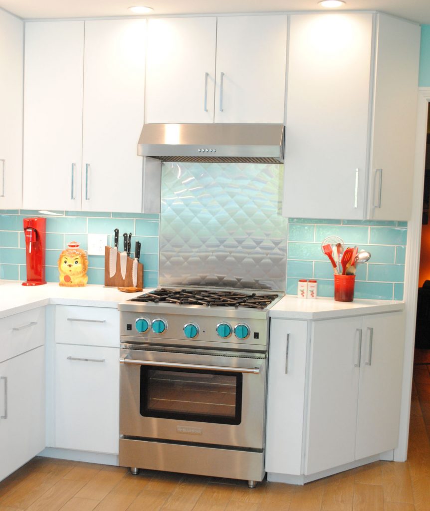
I mean okay, let’s not pretend that it’s entirely my angled cabinet idea or the new pull-out drawers that are so satisfying. It’s in large part that. But it’s also our killer new stove, stainless backsplash behind it, and our backsplash tile.
Mel graciously let me lead the way with most areas of the kitchen, but had two special requests: (1) a no-frills professional style stove (neither of us wanted anything digital, after living with a boring but workhorse 90s stove for several years), and (2) a stainless steel quilted backsplash, kind of like you’d see on a food truck. The stove was our big splurge, and we got a BlueStar. You can pick custom colors for the knobs, so we went with turquoise. Be still, my heart! The quilted stainless backsplash came from Home Depot.
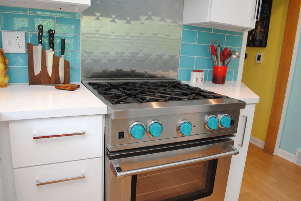
I mean truly, could it all be any better in this kitchen?!
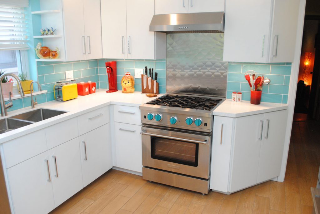
By the way I feel the need to point out, since I made a big deal about it earlier, that I didn’t Photoshop out the toaster cord. We actually keep it tucked behind because Mel worries leaving it plugged would be dangerous. And I’m fine with that, looks better anyway and we don’t use it daily, unlike the tea kettle.
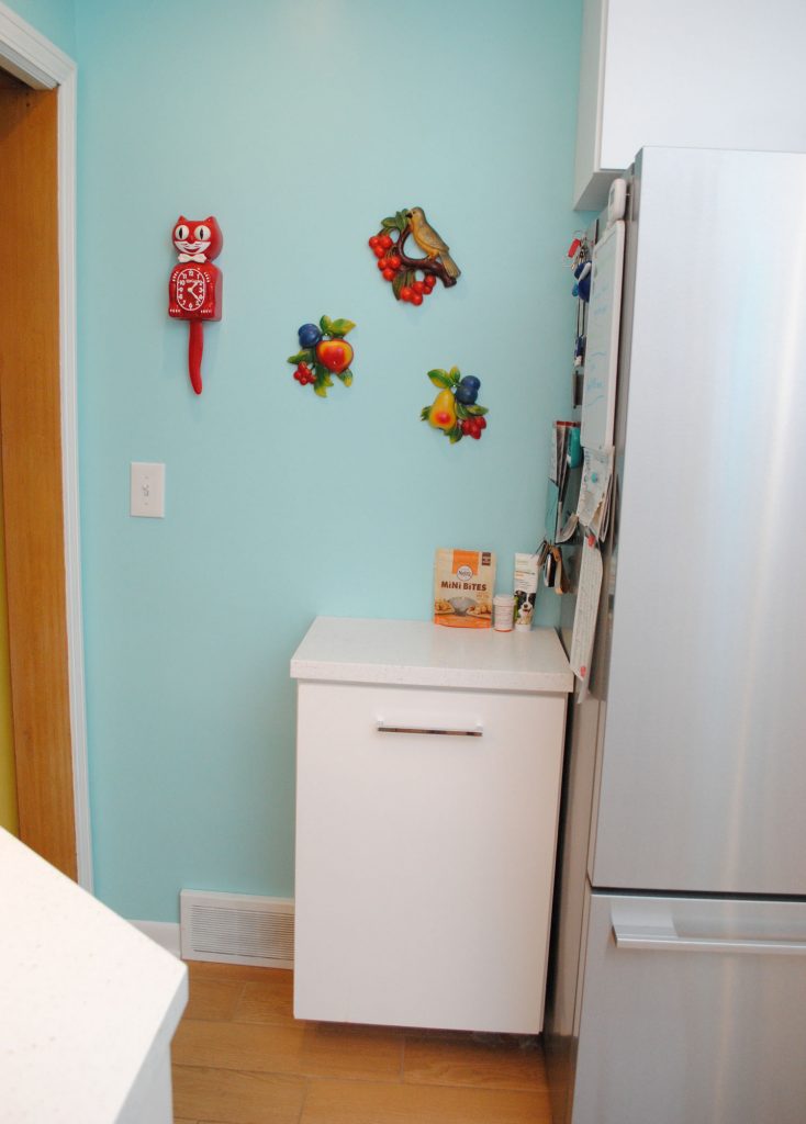
You may be wondering where our trash went, since before, we had a standalone canister to the right of the stove. Well with that area being taken up by cabinets, trash needed a new home. We just don’t have very many lowers, so putting it in a cabinet wasn’t an option.
But we did have space to the left of the fridge, where we used to keep a small shelf with our cookbooks on it. Since they had a new home in a cabinet, I came up with the idea of my dad building a small pull-out cabinet just for the trash, with matching countertop. It’s also our catch-all for things like mail and dog treats, and works out great. And a lot nicer to look at walking into the kitchen then a trash canister would have been. Plus more practical, with the countertop.
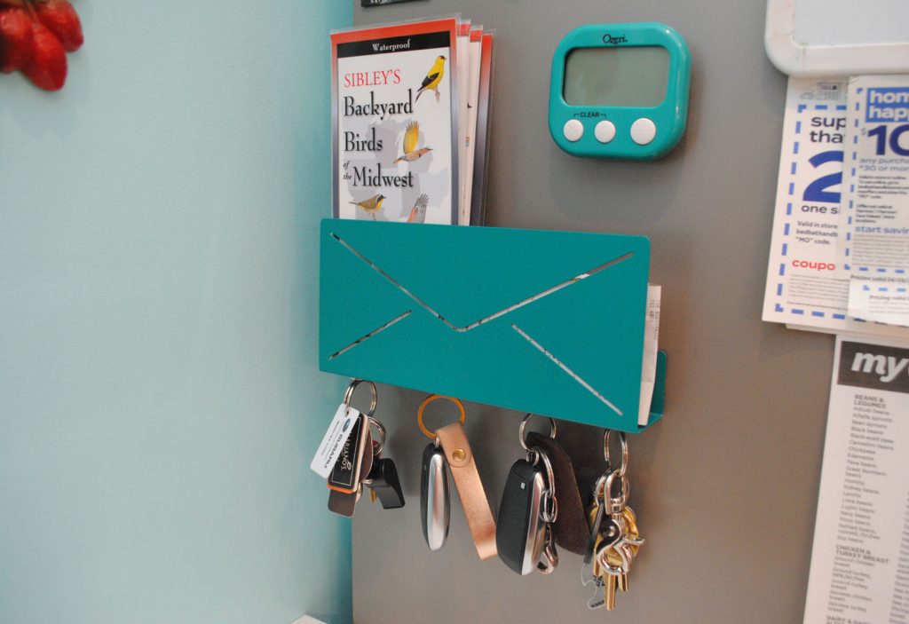
And speaking of mail, to be a little more organized I ordered a mail holder. It came with two magnets for keys, but I added two more, and I glued magnets on the back, to put it on the side of the fridge above the trash unit. We used to keep our keys on magnets on the old fridge, so this was just a nice upgrade.
The fridge is also new. It’s in a weird spot so we had to make the most of a few specific requirements like counter depth so it wouldn’t stick out into the room and wanting a gray side and not black since it’s facing out on one side, as you can see above. Plus we didn’t want an ice maker since they so often break (our old 90s fridge had a workhorse icemaker and we knew we could never top it, so didn’t even try). So we got a Fisher and Paykel French door style fridge.
And yes, we actually do keep the front clear of stuff. After years of putting tons of things on the fridge, we decided we liked it clean now! (But we put a few things on the side still, where the mail holder is.)
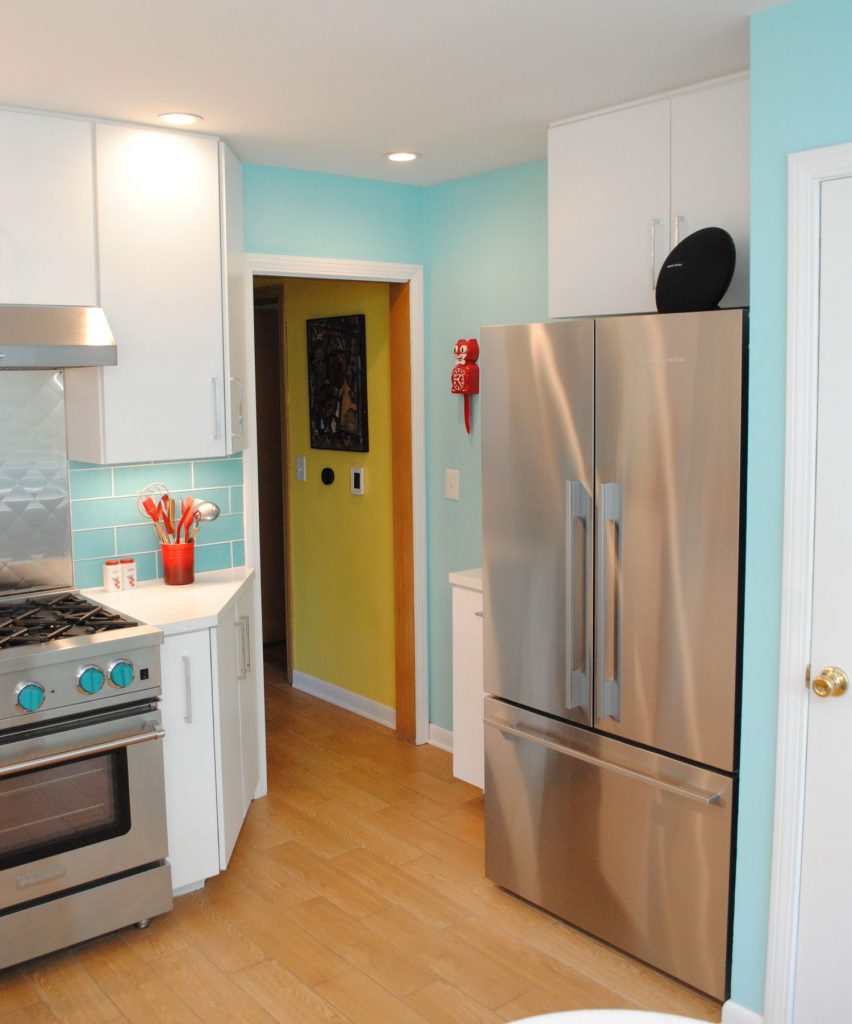
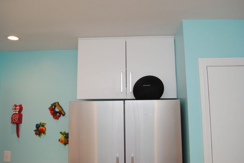
Above the fridge got cabinets, too. We had ones before but these are new due to removing the soffit and the fact that it was a taller fridge. So we made them deeper than the old ones, and they hold a lot! The black thing up there is our Bluetooth speaker.
Where do we go from here? How about let’s turn back around and look at that awesome backsplash tile?!
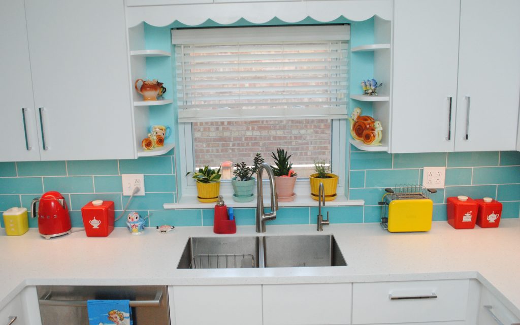
Oh before we do—you may wonder why are the top shelves empty? I wanted to keep those free for new anthropomorphic vintage knick knacks, and we haven’t found anything just right yet.
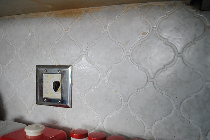
Okay right, so backsplash. Our old backsplash tile was terrible. A 70s or so arabesque style, that wasn’t really white, but an off white with gray that just looked super dingy. Plus it had weird bits of something like glue in certain spots that we could just never get off.
(While you’re looking at it, you can see the switch below to the vintage Blo-Fan in the ceiling that we said good bye to. It wasn’t vented right and we were always too scared to use it.)
When we were initially planning, we were going back and forth between white counters and aqua backsplash, or vice versa. We couldn’t ever find an aqua countertop material that we liked, so we made our decision pretty quickly to do aqua tile. But boy, it was no easy task finding a tile we liked, either!
I am almost positive this is the glass tile we got from Wayfair although for some reason I can’t find it in my order history. I wouldn’t normally have picked as large of a scale as 4″ x 12″ for a small space, but it was the best color when we tested samples in the kitchen with the lights on and off (granted, the old lights). Absolutely no complaints. It’s wonderful!
And with the new lighting, it’s great with the under cabinet lights (under cabinet lights now!!!) when they’re on, and when they’re off:
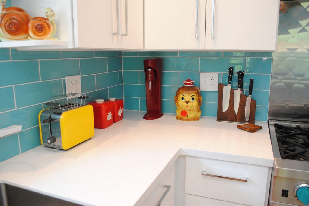
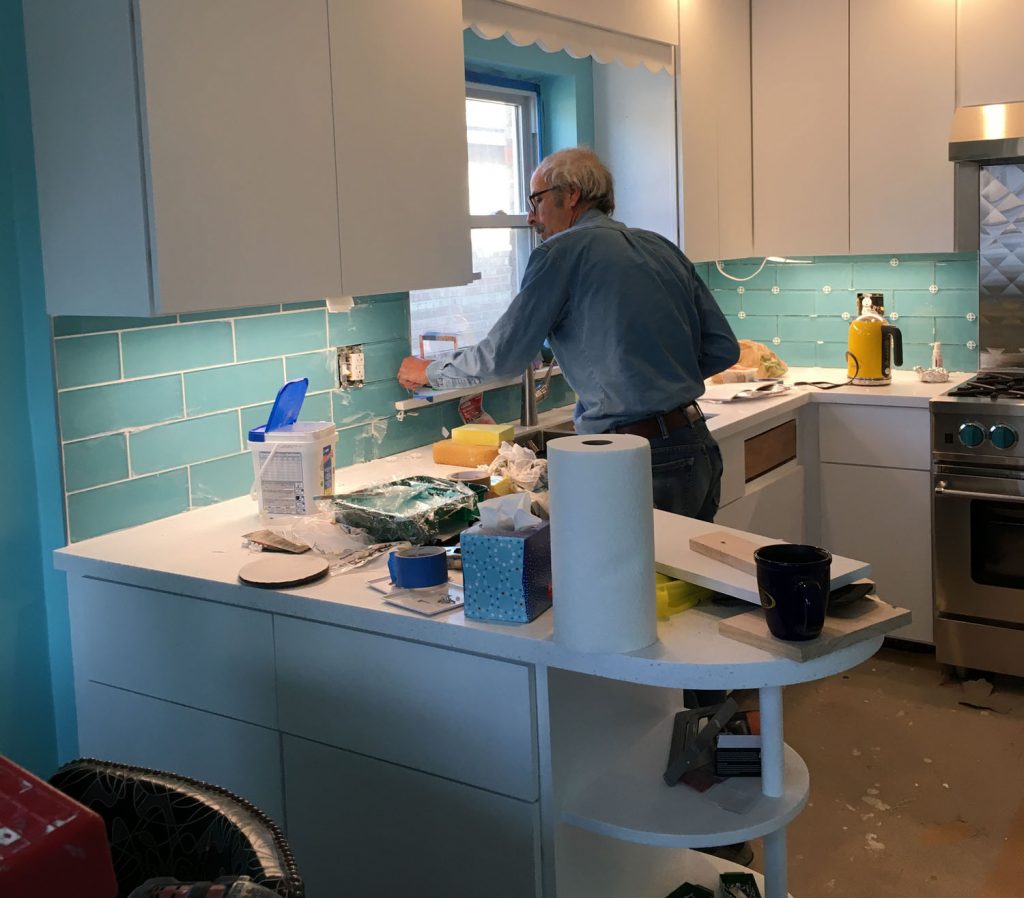
I like this photo of my dad grouting. This was one of maaany satisfying moments in this renovation. 🙂
Are we done in the main kitchen area? I think we are. So that takes us to the dining area! Initially, we had no plans to change anything here. But then we realized we were being silly. You can’t change literally everything in one area and leave the other the same.
Besides, our vintage dinette chairs were well past tired, and we’d always found the hutch to be cute but a bit imposing in the space anyway, and we wanted to refresh this area, too.
And when I look at it compared to the before, it’s amazing how much fresher and less cluttered it feels to us.
One of the big changes in this area is swapping to new silver glitter dinette chairs and matching bench from American Chairs (our vintage table is the same). Ohhh how I love that bench. We were originally going to go with something bright like red for this set, but I’m SO happy we went with silver. We wanted it to look vintage but not look like a diner and stand out against the rest of the room, and we struck that balance perfectly.
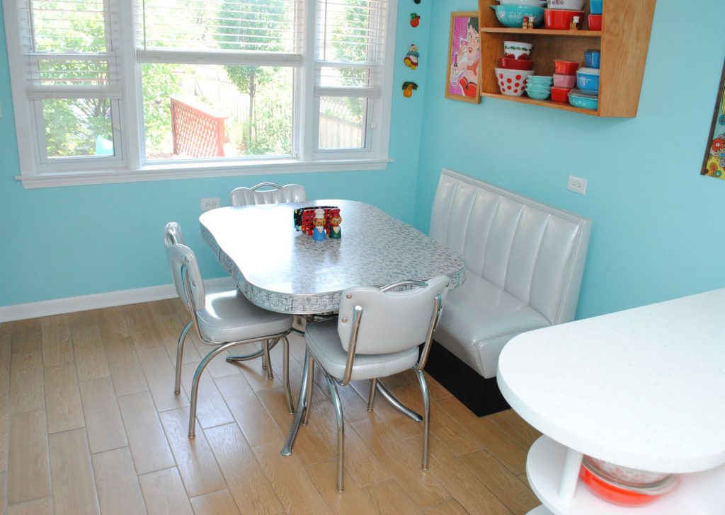
While this area is 7″ smaller due to us pushing the peninsula this way to accommodate the dishwasher, it was totally worth it, and we haven’t really noticed much difference. It’s such a cheerful eat-in area, we spend so much time here!
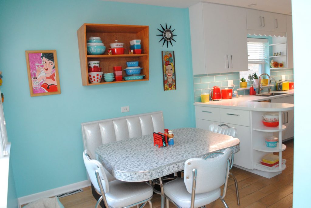
The other new addition in this area is the display shelf above the bench. I love the look of vintage European 60s-era bathroom and kitchen cabinets that have that cool jaunty angle (think these), so I asked my dad to make one to display my Pyrex. I designed it, he made it, I stained it.
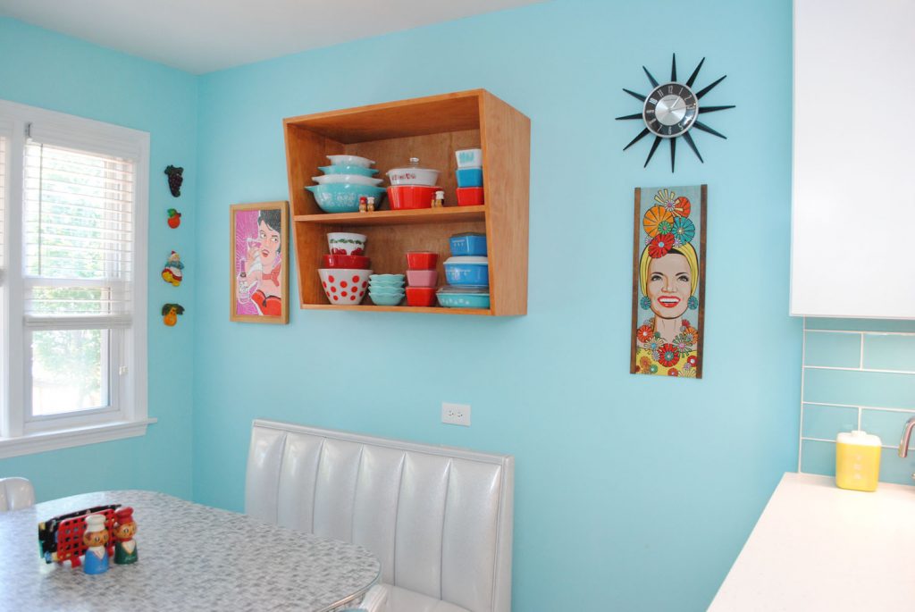
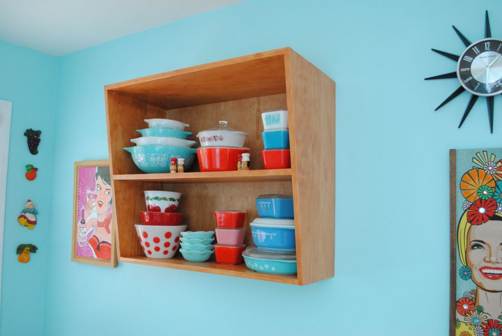
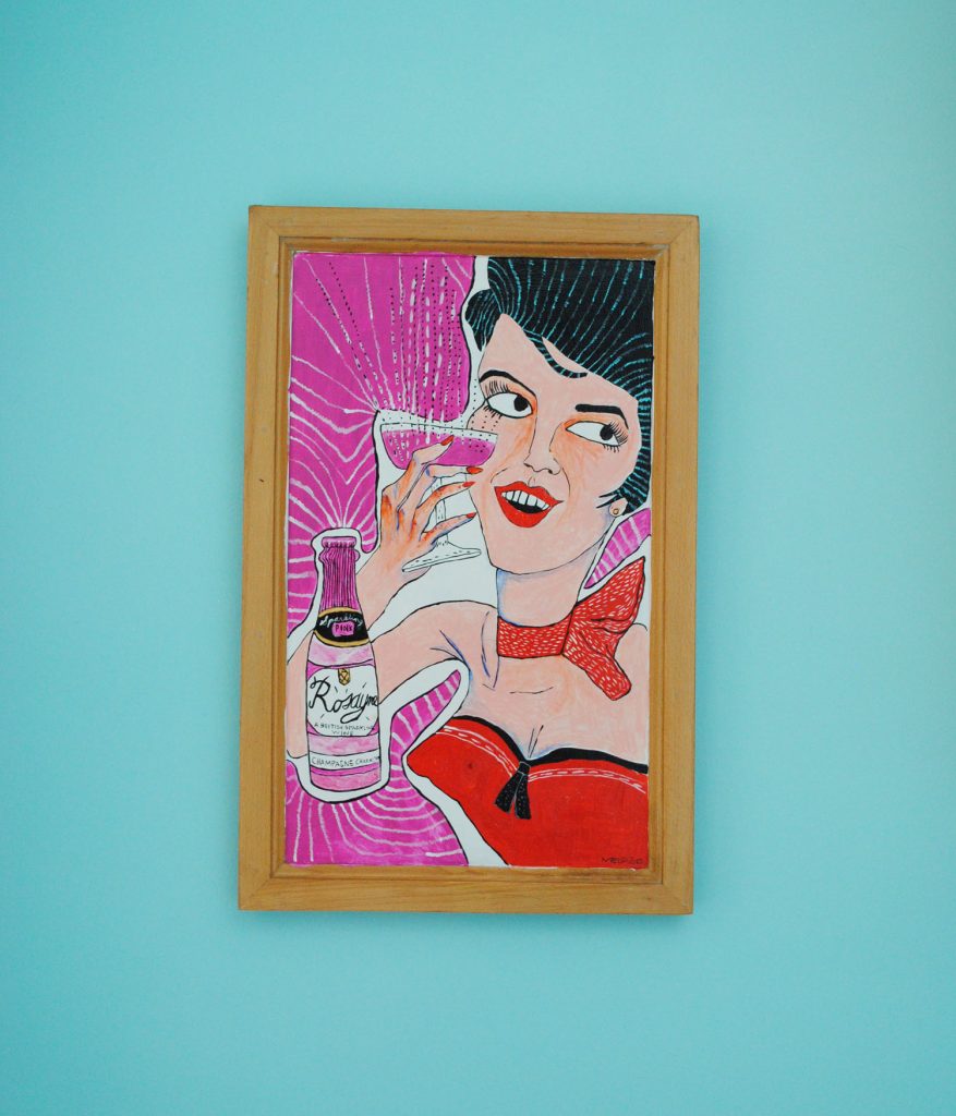
You may also notice a new piece of art, to the left of the shelf. That’s something really special too. We’d always talked about getting a vintage food or beverage poster in the kitchen, but they’re usually really big, and we never got around to it anyway. So Mel got the idea to make a smaller one based on a vintage ad for Rosayne.
The coolest part about this? The ‘frame’ is actually one of our old kitchen cabinet doors! Complete with the hole for the cabinet pull (on her cleavage). I love this piece so much.
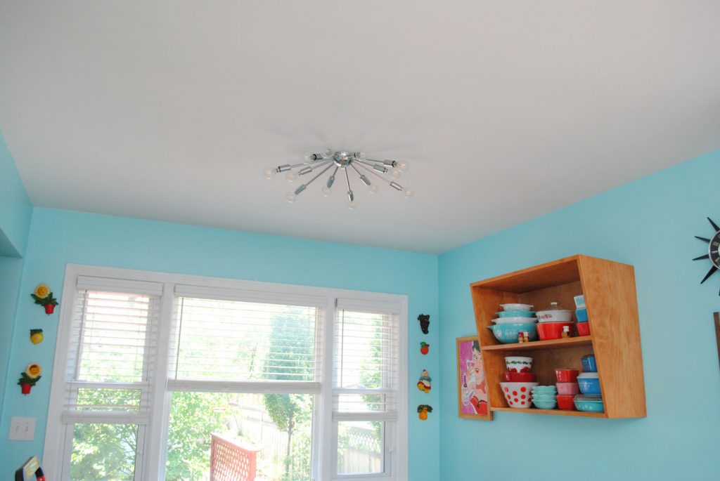
A slightly-less-big but still big-enough-to-be-exciting change is that we ditched our ceiling fan and got a sputnik ceiling fixture from Practical Props. It’s on a dimmer. We adore it! We worried that we might regret it in the summer, but it was August before we even remembered we used to have a ceiling fan. The difference in the ventilation in the floor made all the difference.
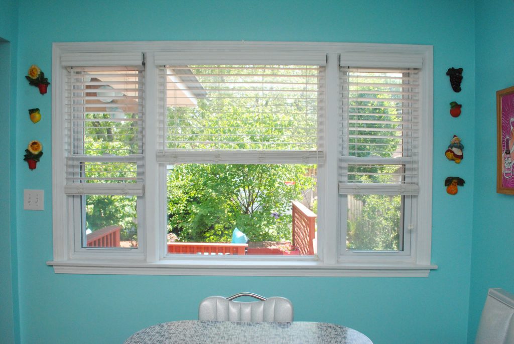
Probably the only other thing to note in the eat-in area is that we removed the chair rail that we never liked, and painted all the trim in the kitchen white, because it used to be this weird wood-tone glaze that we also never liked. It’s not a big change on this wall, but every little bit adds up.
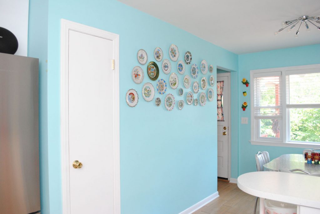
And because that trim extended to the broom closet door, we painted that too. Nothing on this wall changed other than removing the chair rail. Well not that you can see it, but we also refreshed the paint since Behr no longer makes Aqua Spray, our original color, and we had touching up to do, so we had them color match to our current paint and then we re-painted. I took a photo of the plates before so I could make sure to put them back up in the same spots, ha ha.
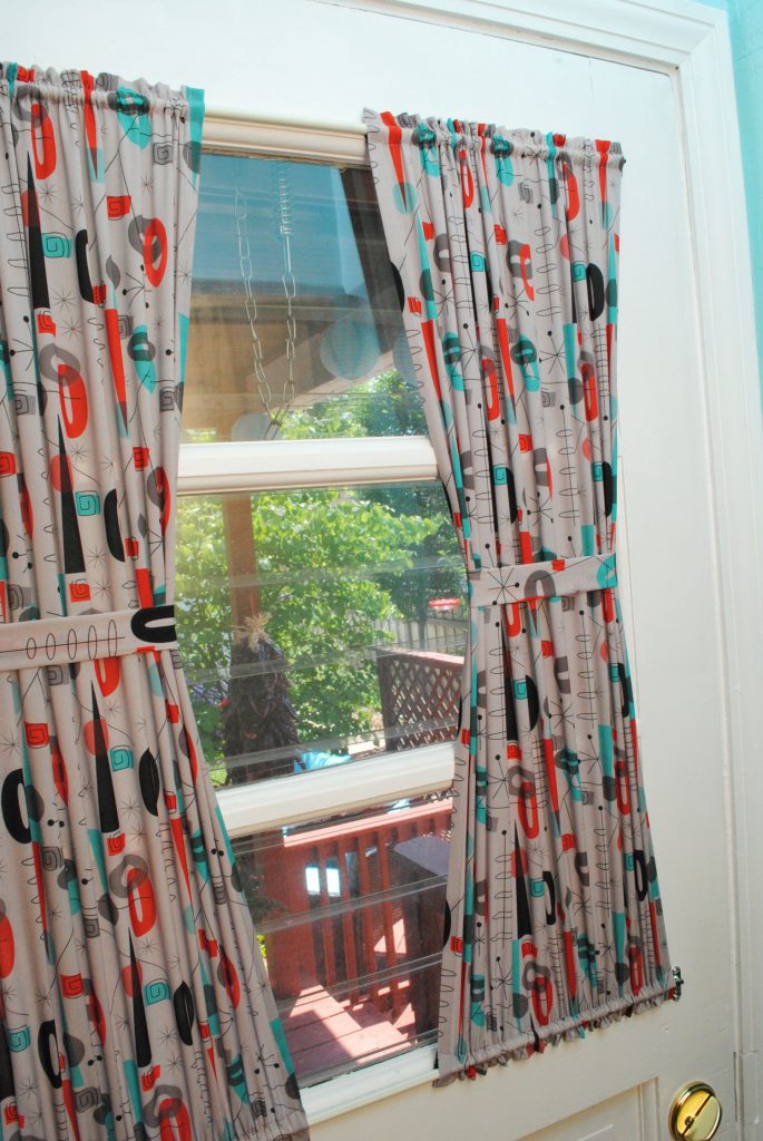
The back door got painted too since it was in kind of rough shape, and felt like it qualified as being part of the kitchen. I made some curtains from Spoonflower fabric after the renovation was finished.
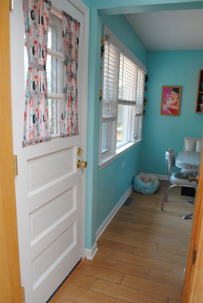
The curtains are sheer and such a nice upgrade from the mini blinds that used to be there! I used this design in their poly crepe de chine. They’re a great touch.
We’re at the back door so are we at the end? I think we finally are!
If you’ve made it this far, thank you for following along on a tour of our new kitchen! I love it so much, it’s all I could have hoped for and more. And 15 months later, I have the perspective to say with certainty that we don’t regret any decisions we made. I still love it just as much as when it was finished.
The space is so much brighter and more cheerful, well lit, modern yet vintage, less cluttered, and SO much more usable and enjoyable to cook in, eat in, and hang out in. I love all the white with the pops of color throughout, between our small appliances, art, backsplash, and other items. We have so much more cabinet space and we even have more counter space. Did I mention we have great lighting now? It’s all dreamy.
And since the pandemic lockdowns started 2 weeks after the renovation wrapped up (!) the timing could not have been more perfect.
Oh kitchen, how I love you!


Love everything about this!! Your kitchen is fabulous. Great blog post!!
I love seeing all the details. Very well thought out. My favorite feature is the turquoise stove knobs.
It looks great! So nice you all worked together!
So my two cents 😀
A. This is a *much* more Tasha and Mel kitchen. I can see both of your personalities in it 🙂
B. The only thing that suggests to me your kitchen flooring isn’t original hardwood is the width of the tiles!
C. Personally, I hate ceiling fans in dining areas because they always make your food cold.
BEAUTIFUL choices!
Absolutely gorgeous. Thanks for sharing.
Your post popped up in my Blogin’ daily email so I thought I’d take a look. I LOVE your new kitchen make-over and everything you did to make it how you wanted it. I always love seeing before/after photo’s and you did a great job showing all the differences. It was a pleasure to read this post, which distracted me from getting on with my daily decluttering and cleaning of my own kitchen haha. Greetings from England 🙂
Oh my! I want your kitchen. I absolutely love it. Our kitchen has the soffits above the cabinets in half of our kitchen. IWlove the colors you chose and your beautiful long door pulls. Would you bring your Dad and do our kitchen? lol It’s beautiful so much fun. Thanks for the tour.?
This remodel is perfect. The attention to every detail has really paid off, as it does in everything you do! I love everything about this.
Sooo beautiful, love the white to the turquoise, bright, colourful and beautiful. Your dad is super handy, say congrats to him too. Have a nice day. 🙂
Tasha, I love your new kitchen, and I also love how much you love it! the detailed tour is super satisfying, especially since I really got more into (much milder) home decor during these lockdowns…
Enjoy your drwam kitchen!
Love the white cabinet refinishing!! Such a beautiful transformation.
I’m trying to think of what to do in our 60s ranch kitchen (also without a dishwasher which needs to be remediated ASAP!) so I really enjoyed this post. Your DIY skills are way above my level but very inspirational! I especially love the shelf you designed in your eat in area and I had no idea you could get tile that looked like wood.
I also thought I would share that if you want to keep your tea kettle plugged in but would prefer to cut the power for safety, they do make single plugs with on/off switches (kind of like a mini version of a power strip) which I use with mine so I’m not taking it in and out of the plug every day but can still cut the power.
Thanks for sharing
Hi
I visited your site. So beautiful idea & Beautiful kitchen design. So beautiful. I like
This is flawless! So uplifting and happy.
I’d love to hear what you think about your stove, etc. after having it a while, so if you’re ever in the mood/have time to do a kitchen redo update, I’d certainly be all ears! (but I know you have a busy life to live!)
I SO envy the dishwasher…
We found out that we have a layer of harvest gold/rust brick pattern asbestos flooring (thanks, 1970’s) under our current 1990’s beige vinyl ugliness, so until we find the bucks to remedy that situation, all our kitchen plans are on hold. It is killing my soul.
This post gives me hope!
(Love your site revamp, too!)
Hey there Tasha, I was just looking for 1950s home interiors ideas, when I came across you and your husband’s remodelling. I am utterly impressed and take my hat off to both of you. Your passion for the era is inspiring to say the least. Congratulations to you both for completing an enormous project in such authentic style.
What a fabulous, talented, and generous father you have! My father started as a carpenter and ended up a contractor building large apartment buildings and planned communities. After he retired, he built our entire house, inside and out, with one helper. He had been a finish carpenter at a point, so he knew those little touches that make things perfect. Also, my mother was a very practical housewife that thought of things like being sure there was enough space between the toilet and the wall to fit the vacuum and mop without contortions. I love your little jewel of a kitchen.
Love seeing your 1950s kitchen brought back to life! Such a perfect blend of vintage charm and modern updates.